Floating menu with mobile and side navigation - PrestaShop Module
Give customers easy access to navigation while they scroll the page. Place a menu at the bottom, top or side edge of the screen.
- Version 0.1.4
- Last update 2026-10-02
- PrestaShop compatibility 8.0 – 9.x
- Multistore Not tested
- Cron job No
- Languages
- Delivery time Sent automatically by e-mail
€56.03 incl. VAT
Installation ⓘLet me install the module for you. I will install it, test it and verify that it works correctly.
Technical support
Domain ⓘEnter the URL of the domain where the module will be installed.
| Product price | |
| Selected options | |
| Total |
PrestaShop floating menu - mobile and side navigation
Keep navigation within easy reach while the page scrolls. Place the menu at the bottom, top or side edge of the screen.
Available languages:

![]()

Bottom, top or side menu
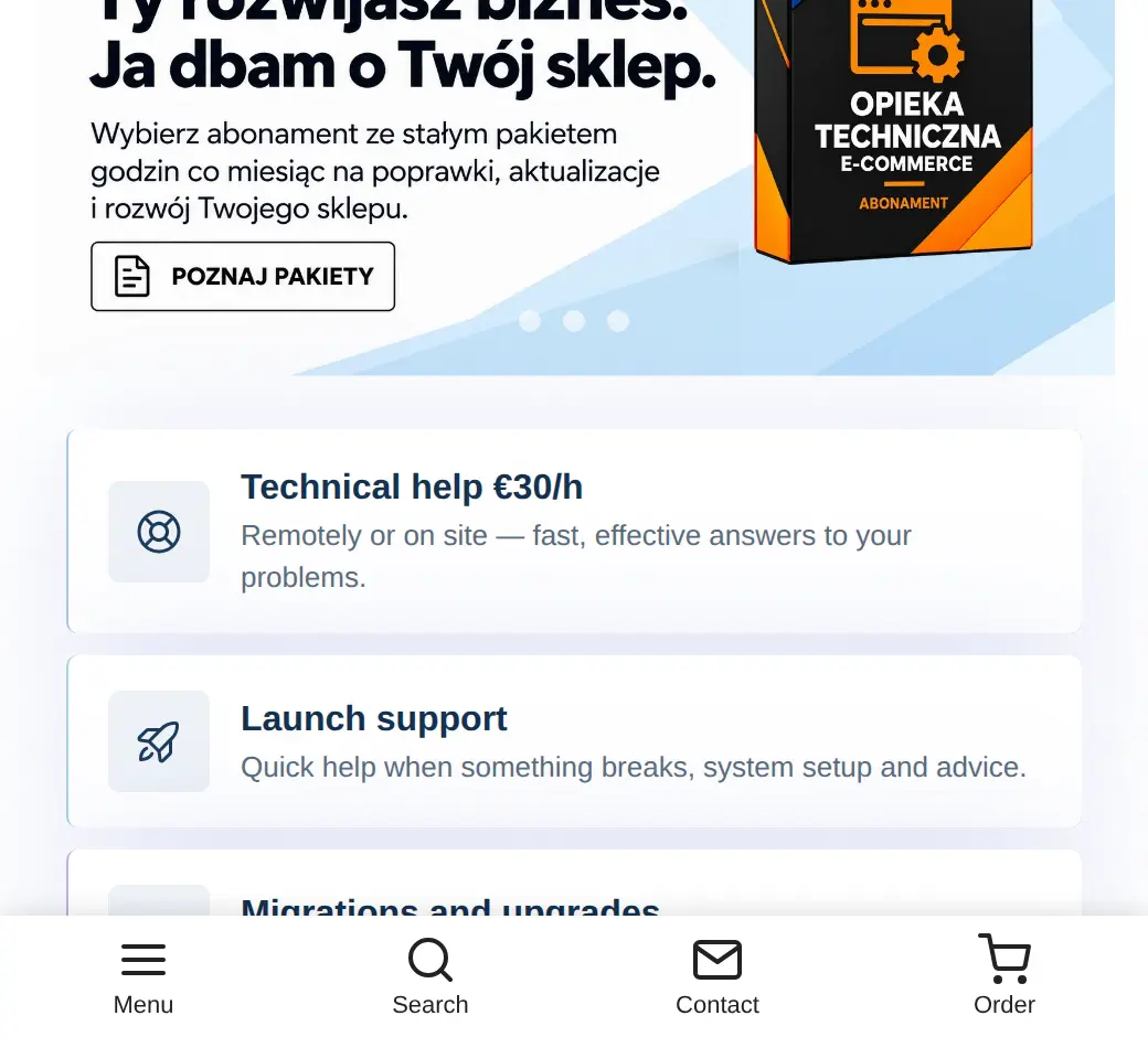
The menu position can match how the store is used. Bottom navigation works well on phones, while a side or top menu adds an extra access point to features.

Scroll behavior and SVG icons
Scroll behavior helps control when the menu is visible. Icons present frequently used actions in a compact form.
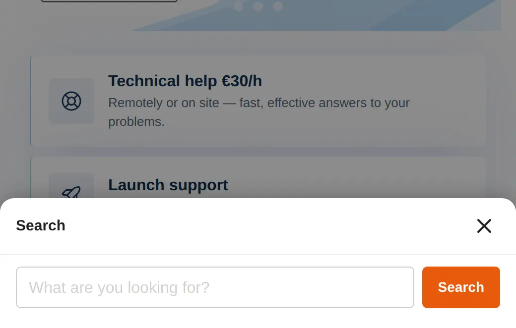
Panels with categories, search or HTML content
Panels can hold categories, a search box or custom HTML. This lets the navigation offer more than single links.
Who is this module for?
A solution for stores that want easier navigation on long pages and mobile devices.
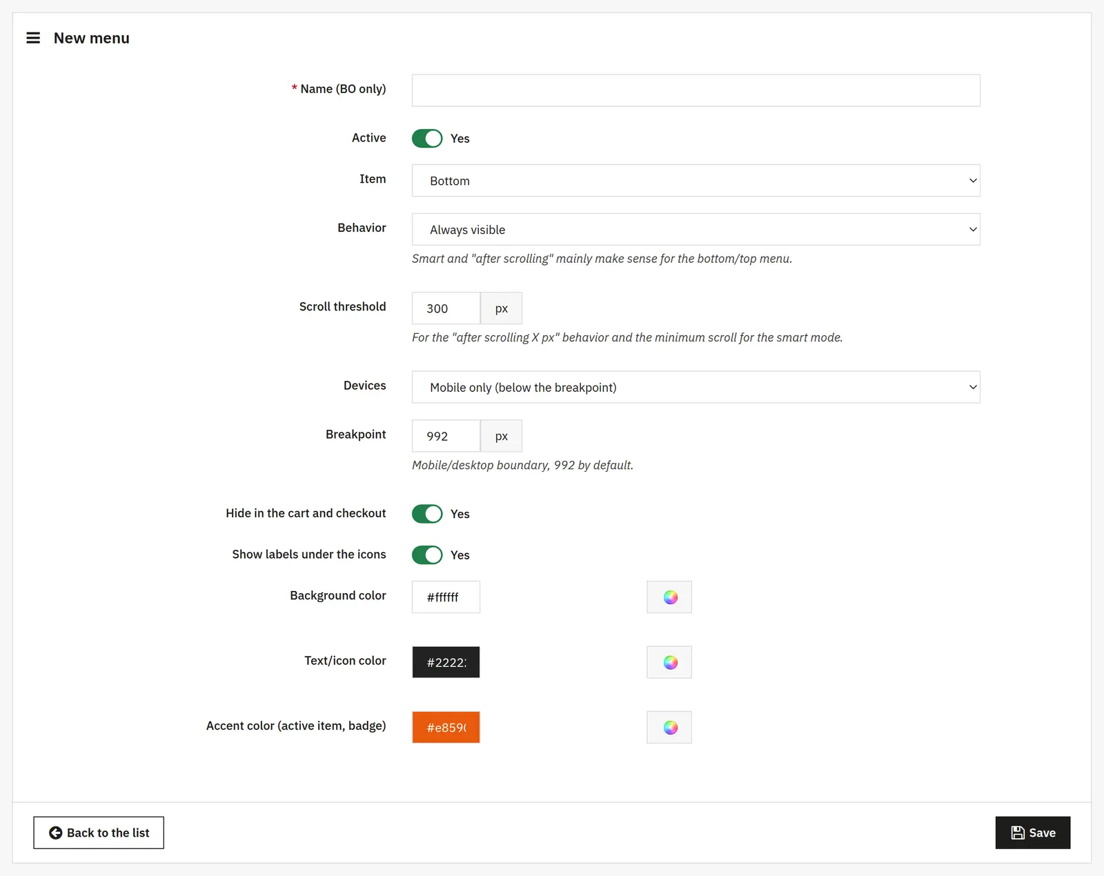
What can you configure in the module panel?

01 / Menu configuration
Menu configuration
- Name, activity and position
- The name keeps menus organized in the back office. Activity enables a given set, and the position sets the screen edge.
- Behavior and scroll threshold
- You choose how the menu reacts to scrolling. The threshold sets the distance required in the after-scroll or smart mode.
- Devices and breakpoint
- You pick the screens where the menu should run and the boundary between the mobile and desktop layouts.
- Cart, checkout and labels
- You can hide the menu during checkout and independently show captions under the icons.
- Colors
- You set the background, the text with icons and the accent used for the active item and badges separately.

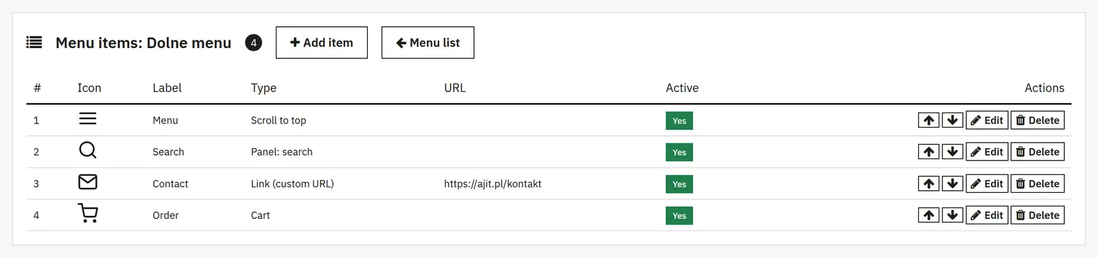
02 / Menu items
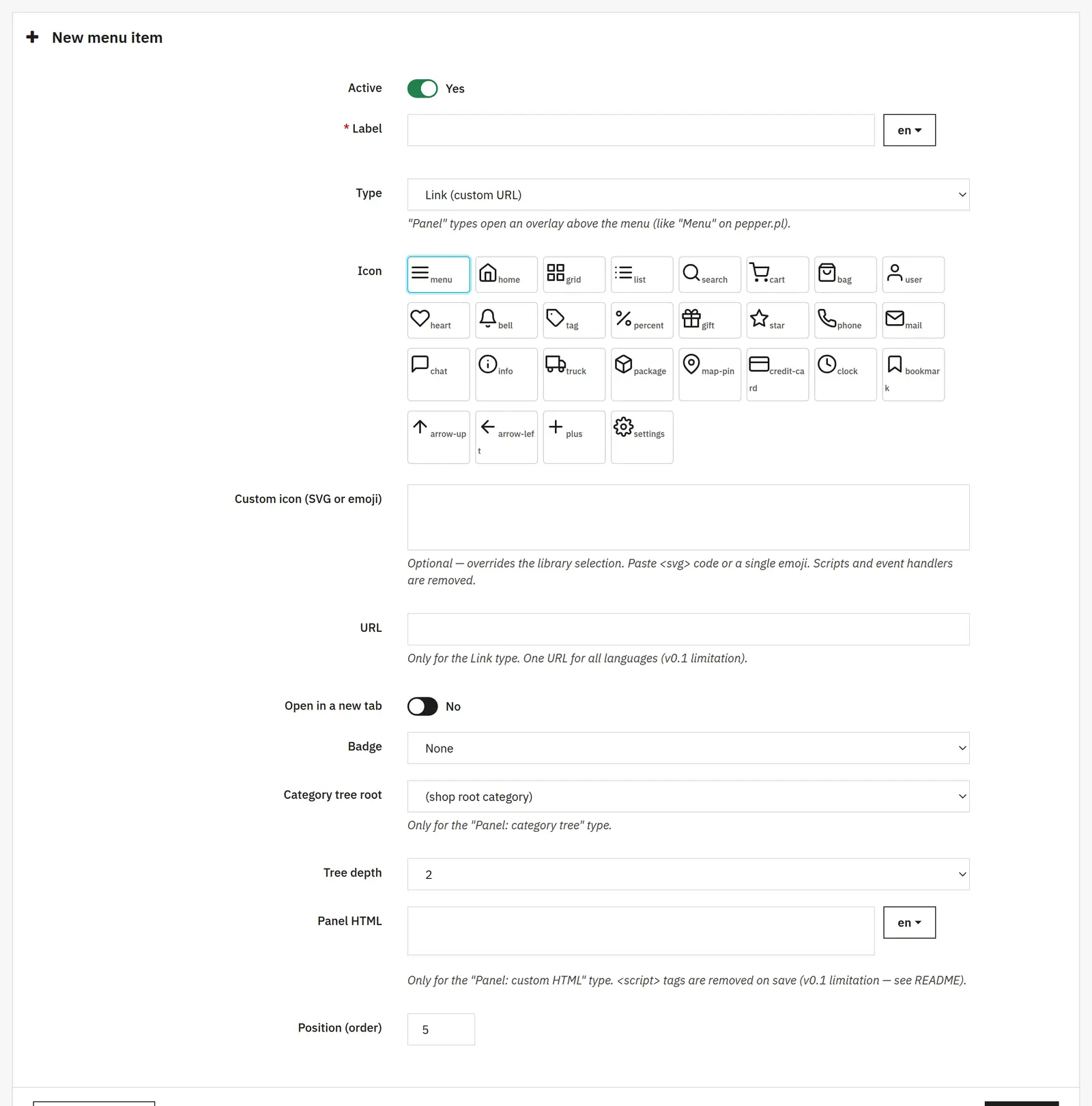
Menu items
- Type, label and activity
- Each item has its own name, on/off switch and action: from a link to a content panel.
- Icon and custom SVG
- You pick an icon from the set or override it with your own SVG or character. Custom graphics take priority over the library.
- URL and new tab
- These apply to link-type items. The URL is shared across languages in this module version.
- Badge and order
- A badge highlights an item with an extra marker, and the position field sets the order in the menu.

03 / Expandable panels
Expandable panels
- Category root and depth
- For the category panel you choose the tree starting point and the number of levels shown.
- Custom HTML
- Lets you place your own content in the panel. Script stripping does not replace checking the pasted content yourself.
Data sheet
- Version
- 0.1.4
- Last update
- 2026-10-02
- PrestaShop compatibility
- 8.0 – 9.x
- PHP version
- 7.4 – 8.3
- Languages
- DE, EN, ES, FR, IT, PL
- Multistore
- Not tested
- Cron job
- No
- Core overrides
- No
- Theme compatibility
- Any theme
- External service required
- Not required
- Source code
- Open, no ionCube
- Licence
- 1 shop (domain), no time limit
- Updates
- Free for 12 months
- Technical support
- Free for 6 months
- Delivery time
- Sent automatically by e-mail
- VAT invoice
- Yes
- Returns
- As stated in the terms
- Package size
- 65 kB
- Demo link
- Link
- Documentation
- Link
No customer reviews for the moment.
0.1.4 03.07.2026 latest
- PrestaShop 9 compatibility fixes.
0.1.3 03.07.2026
- Module installation stability fixes.
0.1.2 03.07.2026
- Stability fixes.
0.1.1 11.06.2026
- Fixes following a code audit.
0.1.0 11.06.2026
- First release. Floating menu with category tree, search and cart panels, 28 built-in icons and custom SVG, position settings, scroll and visibility behavior configurable separately for desktop and mobile.